This Is Why You Need A Mobile Friendly Website Right Now
The most important reason why you need a mobile friendly website is to boost your search engine rankings. Google has made this very clear with its new indexing algorithm update – “Mobile First Indexing”.
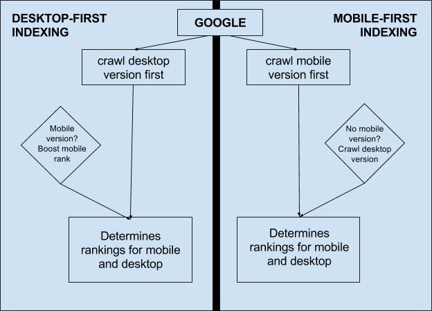
Even though this term has been around since 2016 and Google has been constantly emphasizing on having a mobile-friendly website, this algorithm changed everything. It simply means that Google will be indexing the mobile version of the website first, instead of the desktop version.
What it means, how will it be impacting your website, and how to use it to get an advantage over your competitors are going to be some of the key takeaways from this blog post.

This is why you need a mobile friendly website
The number of mobile users has risen from 400 Million in 2007 to 2000 million in 2015. With more than 90% of the searches happening on mobiles, it is only useful for the website owners to optimize their websites for mobile and this update aims to promote the same thing.
What is mobile first indexing?
With more and more people using mobile for accessing the internet, Google, with its latest update, plans to index the mobile versions of the websites before their desktop versions.
Earlier, the desktop version of a website would be indexed first. This also means that the mobile version of your website will determine its SERP rankings.
Will there be separate indexing for mobile and desktop? No, there is only one common indexing algorithm. The only difference will be that your mobile website will be crawled first and will determine your rankings.
Simply put, this means that a mobile-optimized website will rank higher on both desktop and mobile searches and vice-versa.
How is it going to impact your website?
First of all, you should know that this is not an overnight change. The update is still in its testing phase and will be implemented gradually. Google is first testing it on a limited number of websites which it found to be suitable for testing. It is closely monitoring how the update affects the website and its SERP visibility.
If you have a mobile-optimized website along with an equally identical desktop version, there is no need to worry. A site with a responsive theme which works on both desktop and mobile is also safe from the update. However, if you have a website without a mobile version, your rankings may be affected. The reason behind this effect is that, the search engines will give priority to mobile websites and will rank them higher.
Which websites does Google consider as mobile-friendly?
1. Any website, which loads well on mobile and displays all the content without the need to zoom in or scroll, is considered mobile-friendly.
2. All buttons that get displayed on the desktop version should also be displayed on the mobile version and the user should be able to interact with the elements.
How to build a mobile friendly website
Now that you know the basics of this update, it is time to learn how to build a mobile friendly website.
Once this algorithm is implemented, your competitors with fully optimized mobile websites can rank ahead of you in search results. For preparing your website for the mobile first indexing, you need to take the following steps:
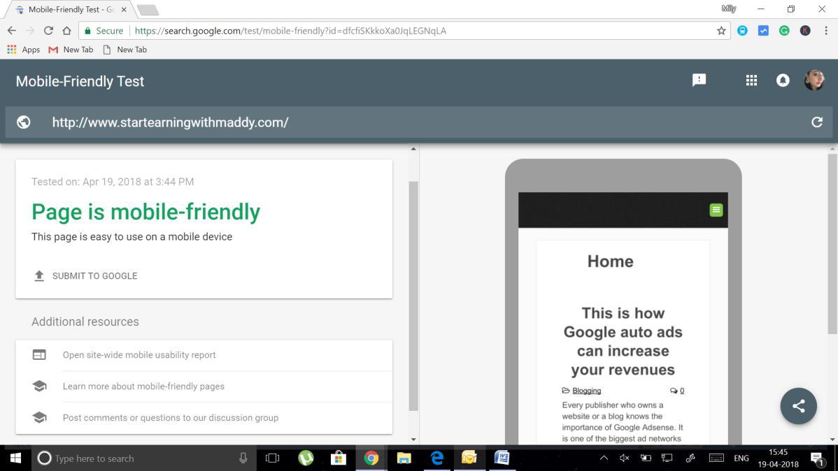
1. Test your website in Google Mobile-Friendly Test window to check how your website performs on mobile. If it is mobile-friendly, the test will display it. If it is not, Google will suggest some changes which can correct the issue.

2. Once the site is checked for mobile-friendliness, it is time to optimize it for the users. Sites which offer a good user experience are going to rank much better. The most important criterion which determines the user experience is the site speed. Check the speed of your website on www.gtmetrix.com to gauge the site speed and the elements which might be slowing down the site.
Taking your advantage to the next level
The next step is what will make your website different from other websites with regards to this update. This step involves optimizing the content of your website for a mobile first design.
Most mobile-friendly websites do not offer mobile-friendly content. This will be the step, where you get an advantage over other websites which have stopped after the first step.
1. While SEO experts cannot stop emphasizing on long-form content, reading a 4000-word article on a mobile screen is a task. If you are planning to use long-form content, go for smaller paragraphs.
2. Infographics are the next big things. Include simple yet effective infographic in your content.
3. Use multiple content types like audio and video content. Including a video with your content can bring a positive change in your user experience.
4. Optimize your images. Avoid using bulky graphics which can slow down the site.
5. Remove any interstitial elements and pop-ups that can degrade the user experience.
6. Use a font size which is easy to read and allows the user to interact with the clickable elements easily.
7. Enable browser caching for a better user experience.
8. Implement mobile switchboard tags. If you have already placed them, there is no need to change anything.
The final step
Now that your website as well as your content is optimized for mobile-viewing, submit the sitemap to the search engines again.
This will let the search engines know that the website has been updated. Including structured data by creating a Silo website and Google Schema markup is another way to improve your rankings in the eyes of Google.
Are you ready to take action now?
These are the basics of mobile first indexing update by Google and how can you implement a mobile first design to get an edge over other websites.
Not all website owners think about enriching the user experience. Most website owners simply leave the website at the stage of mobile-friendliness and this is where the content optimization comes in play. Focusing on optimizing the content for a better user experience is another important aspect of this update.
Once you have a mobile-friendly website, improve your content to suit mobile users. If you do not have a mobile version of your website yet, your desktop version will take a hit in terms of rankings after this update. So, it is better to switch to a responsive theme which works well for both versions.
Have you optimized your website to face the mobile first indexing algorithm by Google?
If this blog post helped you, please share it with your friends and help them too. I would appreciate it. 🙂