19 Pop Up Sign Up Form Ideas To Convert Your Visitors Into Subscribers
Let me ask you a question?
What makes a great blog great?
If you think it’s the ability of the blog to engage its readers, you are only partly correct. What makes a great blog really great, is its ability to convert its readers into subscribers.
Subscribe
You see, if you can create a blog focused on quality, you can keep your readers hooked. And if you use the right pop up ads, you can convert these eager readers into loyal subscribers. Ask any Internet Marketing guru and he will tell you that a responsive email list is the biggest asset. It is a very powerful tool that you need, to build a sustainable passive income online.
So how does this work?
1. You create a unique, informational and helpful piece of content and post it in your blog. People find your content through organic search or one of the social media sites.
2. They find it interesting and start reading it.
3. When they are halfway through it, or when they are just about to close the page…
4. BOOM… A pop up ad opens asking them to subscribe to your newsletter. If you use the right incentive for signing up, the interested reader now becomes your loyal subscriber.
5. The person who signs up thinks you know more than them, and is willing to learn from you. The next time you produce a good blog post, you can send them an email and they will be eager to read it.
6. After you build enough rapport with your subscribers, it is time to convert your loyal followers into eager buyers. You can start selling them your own products or make a commission by recommending other people’s products. But remember, always focus on helping your subscribers first. Only sell them something if you genuinely think that it will solve their problem.
To help you focus on creating high-quality content without wasting too much time on finding the right pop up ad design that works, I researched famous blogs on the topic and visited more than 200 famous blogs and websites with a huge following to create this list of 19 high-converting pop up ads.
Simple ideas to tweak your pop up forms and convert eager visitors into loyal subscribers
1. KEEP IT SIMPLE
Just like treeblogger, keep things simple. Offer to send updates when you publish new and informative blog posts.
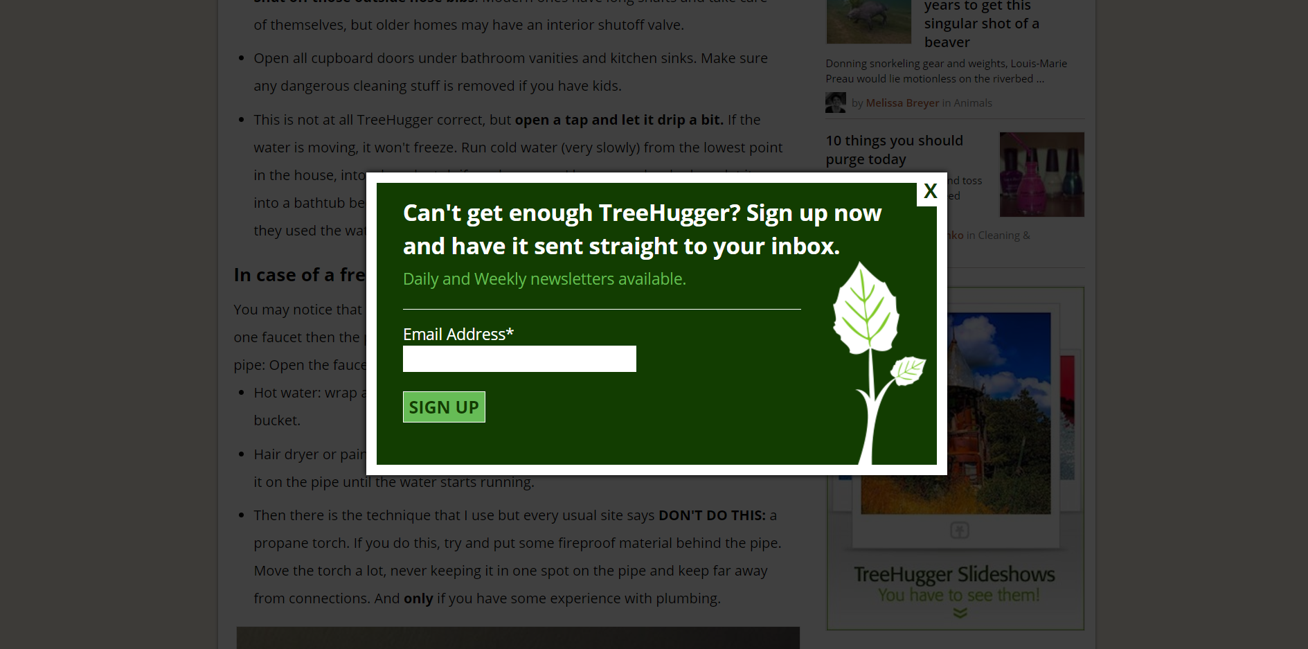
credits- www.treeblogger.com
2. KNOW YOUR READER
Do your due research and find out what your readers are looking for, and what their problems are. Offer something that is valuable, relevant to your audience and solves one or more of their problems.
Take WPBeginner for example. People who visit their website are mostly amateur to intermediate level bloggers. By offering wordpress videos, plugins and other resources that can benefit their readers, they make sure that their offer is extremely valuable and relevant to their audience, thereby increasing their conversion rate (Number of subscribers/Number of readers).
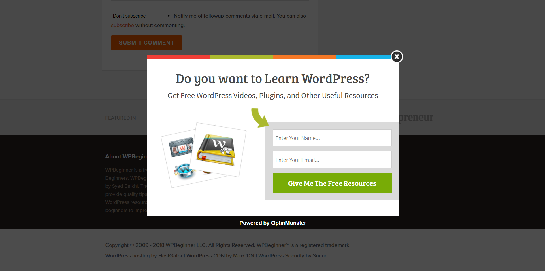
credits-www.wpbeginner.com
3. DONT SPAM
According to templafy.com, an average worker receives 121 emails everyday. The concern of every person, therefore, is that you might spam them. Make it clear to your visitors that you won’t spam them.
I like canvas-of-light for two reasons. 1) They ask a question to make their audience think. 2) After their readers start thinking and reach the right state of mind, they offer incentives for signing up, that are extremely relevant to their audience.
Ask the most pressing questions and offer the most valuable incentives for signing up. If not, this simple yet effective technique won’t work.
4. TELL THEM WHEN TO EXPECT YOUR EMAIL
Garyvayner Chuk tells his readers that he sends an email every monday morning. This not only tells the reader he won’t spam them, but also informs them when they should expect his email. Since it is sent only sent once a week, the readers assume that it is highly valuable.
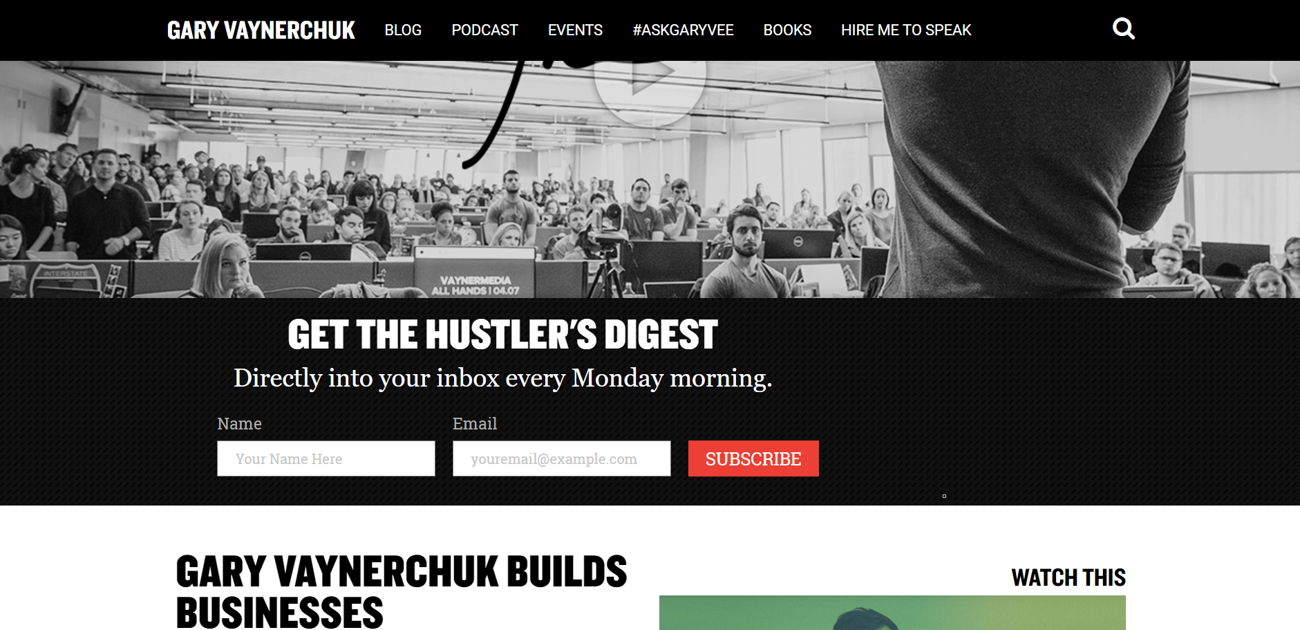
www.garyvaynerchuk.com
5. OFFER A DISCOUNT
If you run an online shopping store or sell products or services, offer a discount for people for signing up.
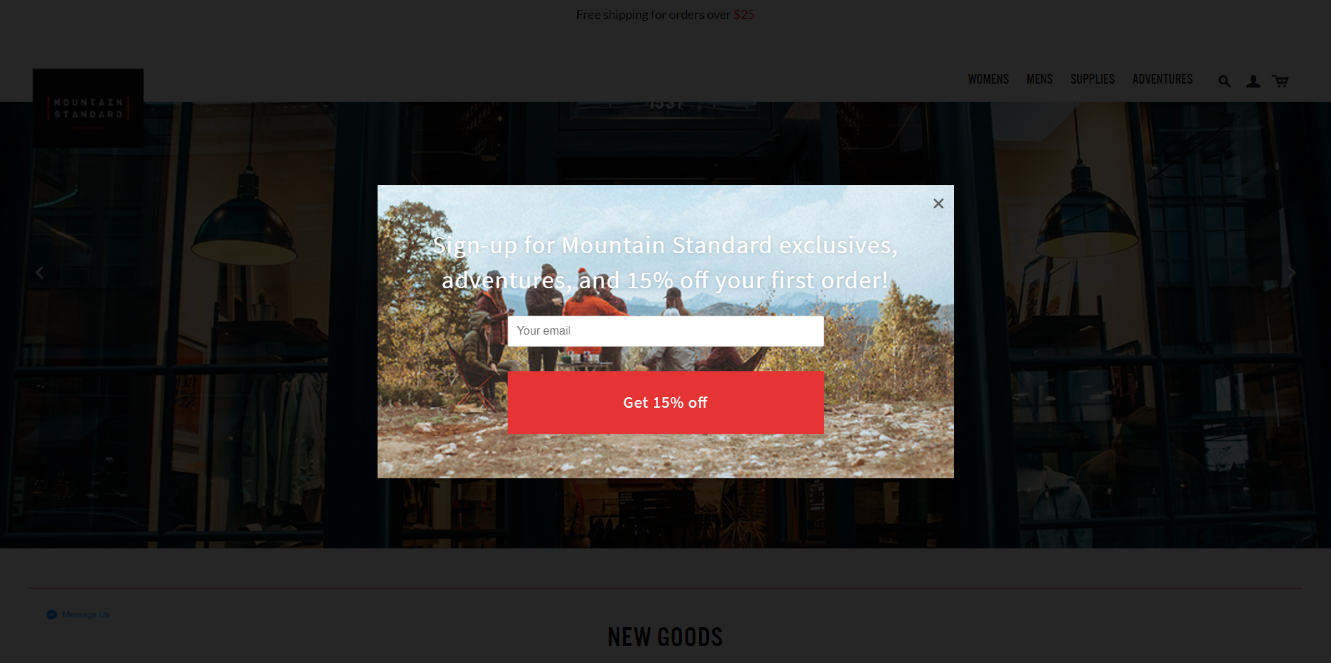
Mountain Standard offers a 15% off the first order exclusively for their subscribers. This is an incentive that most people wouldn’t want to miss.
credits – www.mountainstandard.com
6. OFFER A CHOICE
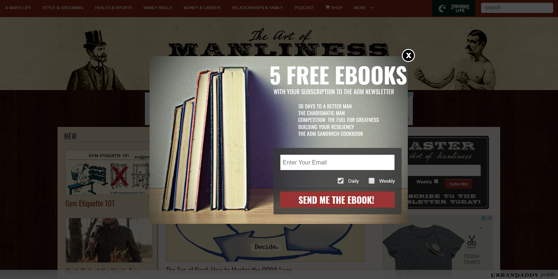
Offering a choice to your readers to choose between daily, weekly and monthly subscriptions can increase your conversions greatly.
Art of Manliness does this perfectly. Their pop up performs because of two reason: 1) They offer a choice, 2) They offer more (They offer not just one, but 5 free relevant ebooks for signing up).
credits-www.artofmanliness.com
7. USE VISUALLY STIMULATING BACKGROUNDS TO ENTICE YOUR CUSTOMERS
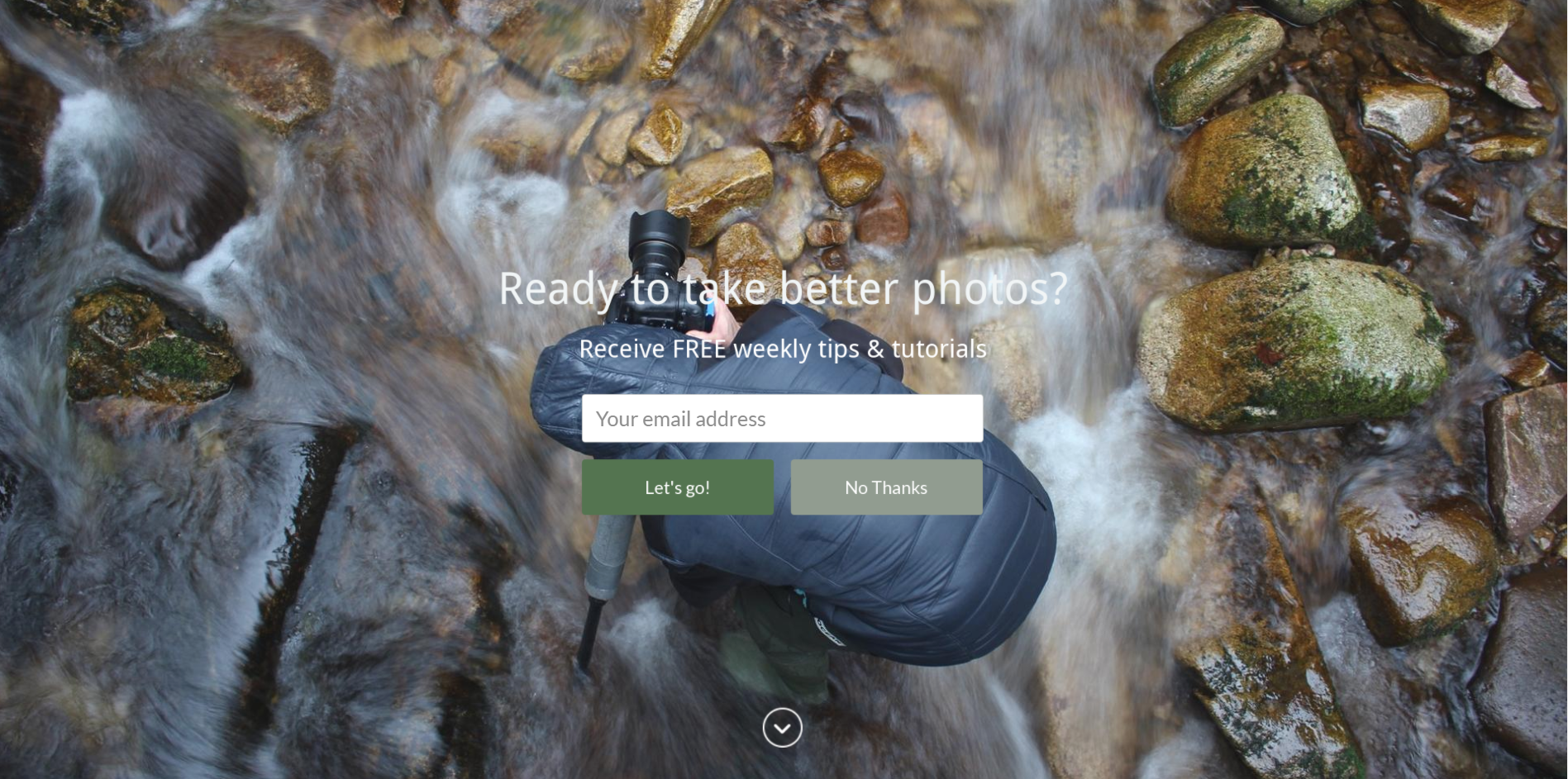
Digital photography school uses this concept to improve their conversions. Any budding photographer would want to put himself/herself in the shoes of the photographer in the background. This gives them a positive feel about Digital Photography School, thereby enticing them to sign up.
credits-www.digital-photography-school.com
8. USE A COMPLETELY DIFFERENT DESIGN FOR YOUR SIGN UP FORM BACKGROUND
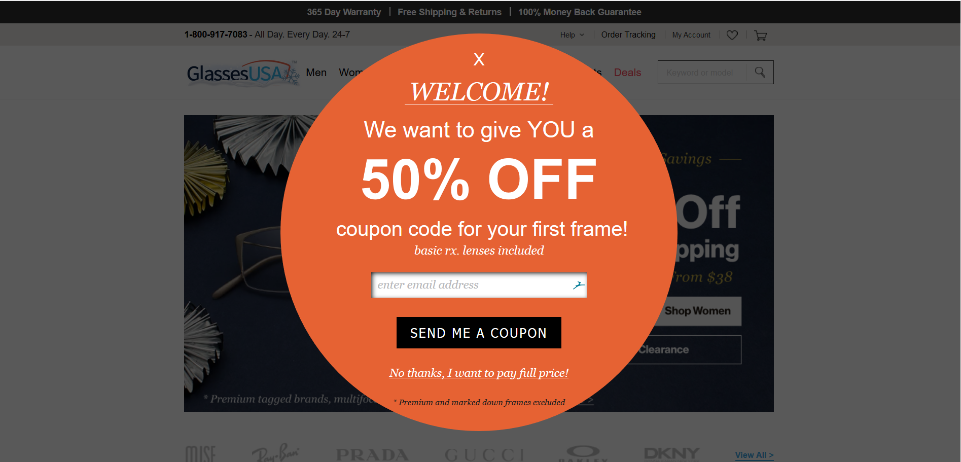
Glasses USA provides a classic example for this case. Their website design consists of straight lines with dark colors whereas their sign up form uses a circular sign with a bright color that captures the reader’s attention immediately. On top of that, they offer a 50% on the first frame that gives the reader a strong reason to become a subscriber.
credits – www.Glassesusa.com
9. CREATE A SENSE OF URGENCY BY USING THE SCARCITY MODEL
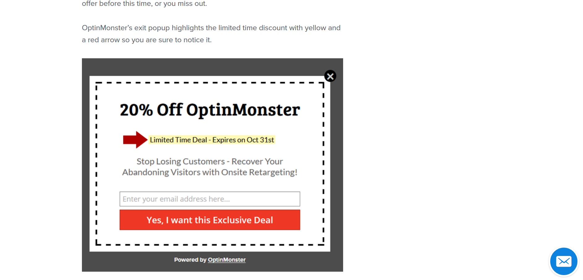
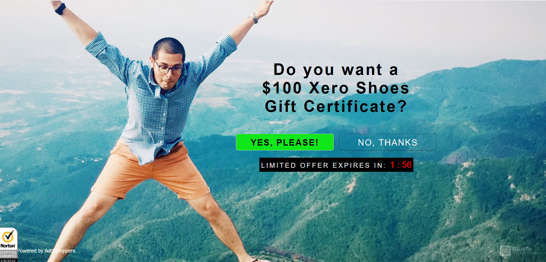
How many times have you seen a ‘20% OFF for 10 days’ symbol while window-shopping and walked off without being tempted to buy it. The chances are, if it was something you want and if you had the money to buy that, you would have bought it. And that’s exactly what you can utilize to convert your readers into subscribers too.
OptinMonster displays a deadline using the text ‘Limited Time Offer – Expires on …’ to create a sense of urgency. Xero shoes, on the other hand, displays a countdown timer to urge the user to take action.
credits – www.Optinmonster.com
credits – www.xeroshoes.com
10. USE NUMBERS
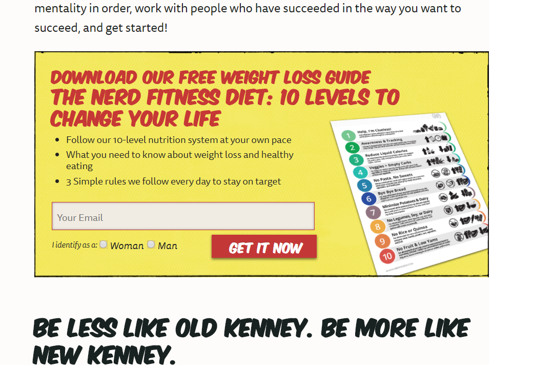
Using numbers makes you look wiser. This is a great catalyst to make your reader subscribe to your newsletter.
Nerd Fitness does this perfectly by creating a 10-level weight loss diet plan. The beauty of such a level is that, it makes the readers compare themselves with this list. And naturally, if they want to lose weight but find themselves at any level other than 10, they will subscribe.
credits – www. nerdfitness.com
11. LET THEM FIND OUT
If you sell a service or a software, offer a free version that pre-sells your service/software. This is even better if your buyers are website or business owners. You can offer to freely test their website (or business) to let them find out how their website compares to other websites.
Justuno is a conversion optimization platform to build email lists, drive more sales and reduce shopping cart abandonment. They offer a free email sign up form analysis to make people sign up. This does two things: 1) It only encourages customers who are qualified for the product to sign up, 2) It pre-sells their product. This way, even though not all their website visitors will become subscribers, most of their qualified subscribers will become their loyal buyers. Since their software is billed every month, low front-end conversion doesn’t affect them.

credits – blog.justuno.com
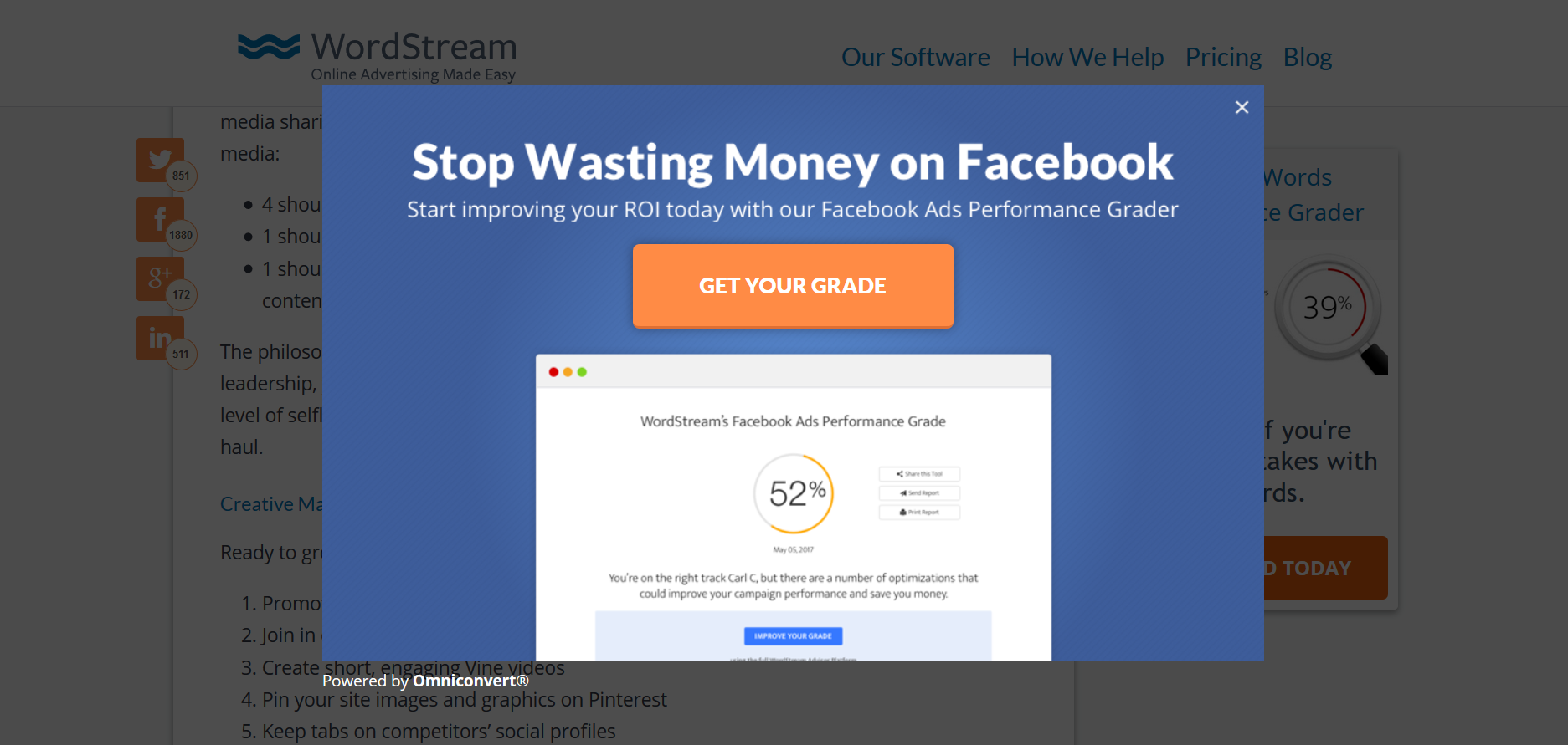
Wordstream help improve the performance of their customers’ online Advertisements. They offer a free grading of facebook ads for people who sign up. They have also included a sample picture of a graded advertisement to help readers visualize the end result.
credits – https://www.wordstream.com/
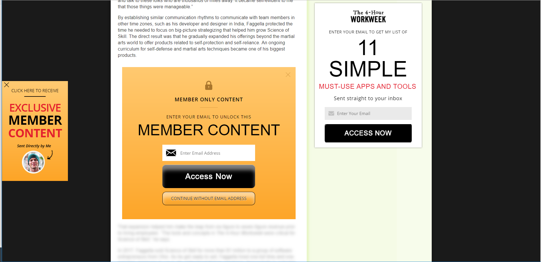
12. LOCK YOUR CONTENT
So, this is how it works:
-
Create unique, super-valuable pieces of content
-
Offer a part of the content for free for your readers.
-
Lock a part of the content and make it only accessible to subscribers.
Tim uses the same concept in his blog to convert eager readers into loyal subscribers.
credits-www. tim.blog
13. OFFER A CONTENT UPGRADE
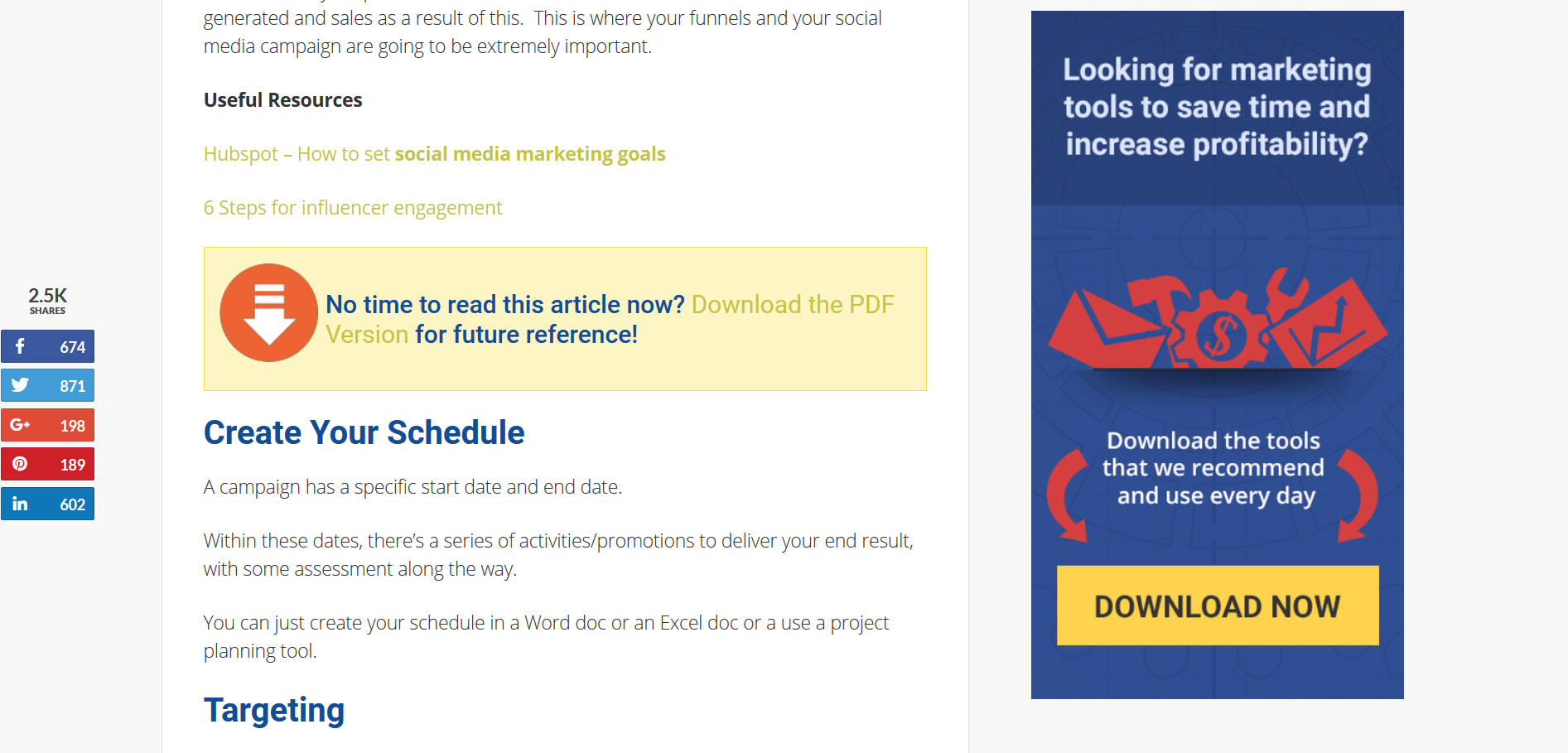
Content upgrades convert very well. They give users the privilege of saving the blog post in another format to read it at a later date. Find the blog post in your blog that has the highest reading time and offer a content upgrade for it.
Razor Social provides users the choice to download the blog post as a PDF file. Users can download the PDF file and read it later.
credits – www.razorsocial.com
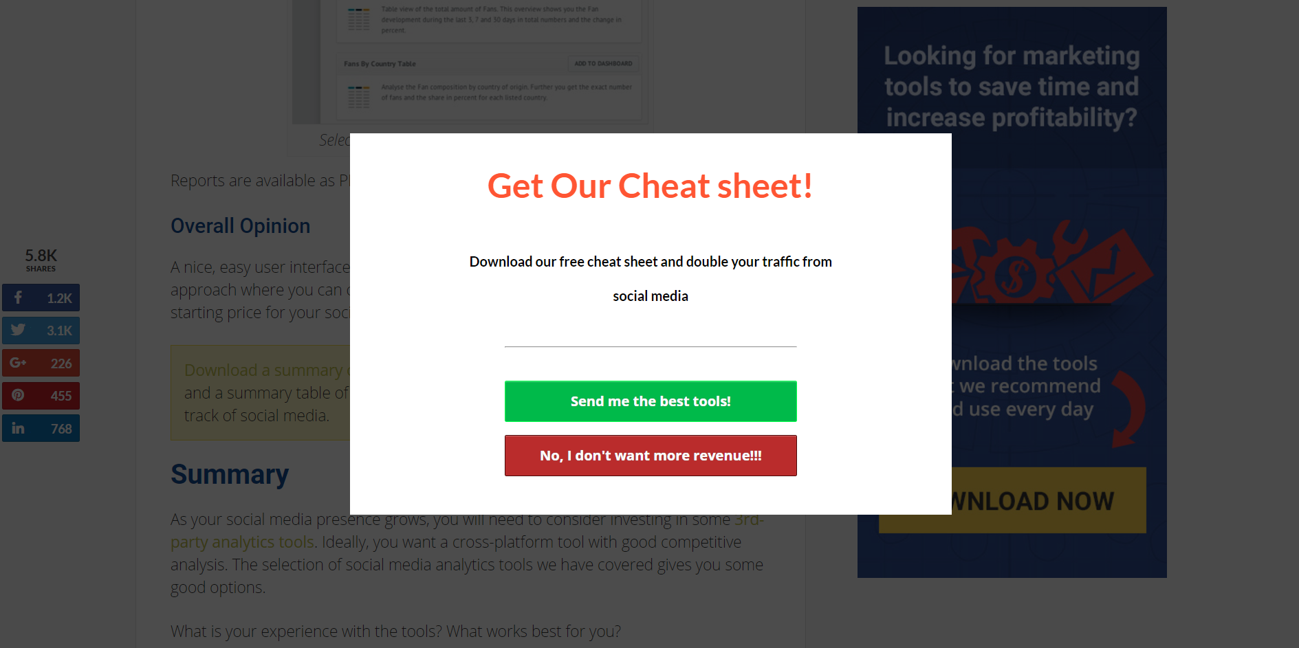
Razor Social provides users a cheat sheet. If you don’t know this already, cheat sheets are in great demand today. Don’t get me wrong. Longer blog posts keep the readers engaged for a very long time. However, cheat sheets that provide a short description of the long blog post are very useful in the long run.
credits – www.razorsocial.com
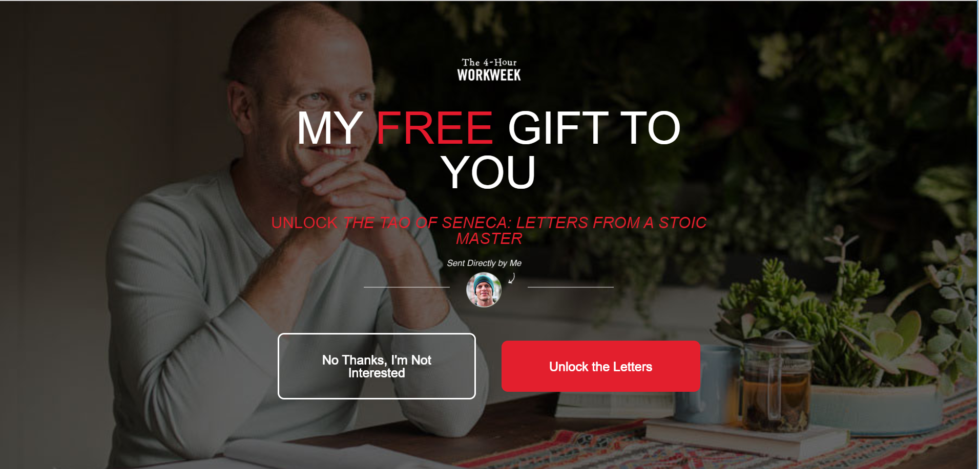
14. GET PERSONAL
Depending on the field you are in, adding your photo to your sign up form can improve conversions. People start trusting you because, they now know that there is a real person behind the website.
credits -www.tim.blog
15. USE TESTIMONIALS
Testimonials are a nice way to establish your credibility to your readers. If you sell a product/service or if you have helped someone in your field, ask for a testimonial. You can then add their testimonial to the pop up form. This is a sure-fire way to improve conversions. Betty’s website is a nice example.
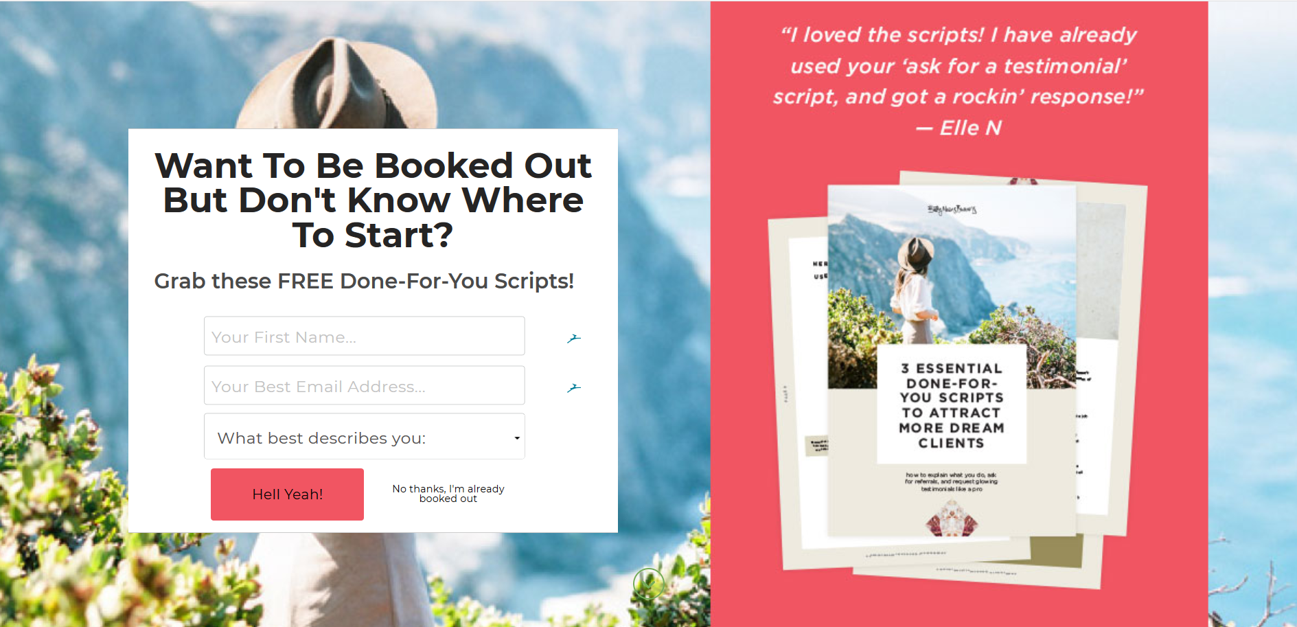
credits – www.bettymeansbusiness.com
16. SHOW THEM WHAT YOU’VE GOT
When your readers think that you know more than them and respect you, they will not just want to subscribe to your newsletter, but also become your loyal fans. There is no better way to do that than to establish your credentials. If you’ve ever been acknowledged by any famous personality/organisation, don’t hold back… Just brag about it.
Timothy sykes is a millionaire penny stock trader and entrepreneur. He is known for earning $1.65 million by day trading while attending University. In his website, he shows off his credentials in his sign up form. Undoubtedly, this has been a great catalyst for improving his conversions.
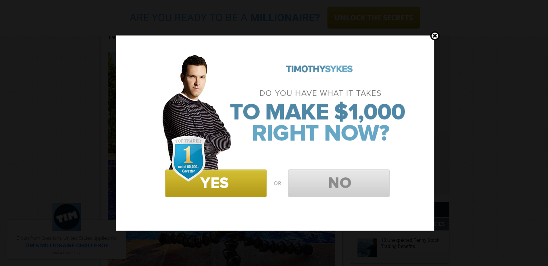
credits – www.timothysykes.com
17. SHOW THEM WHERE THEY BELONG
As humans, we have this evolutionary need to belong to a community. You can make them feel that they will become a part of a community by signing up. Just like Matt,You can do this easily by displaying the number of active subscribers you have.
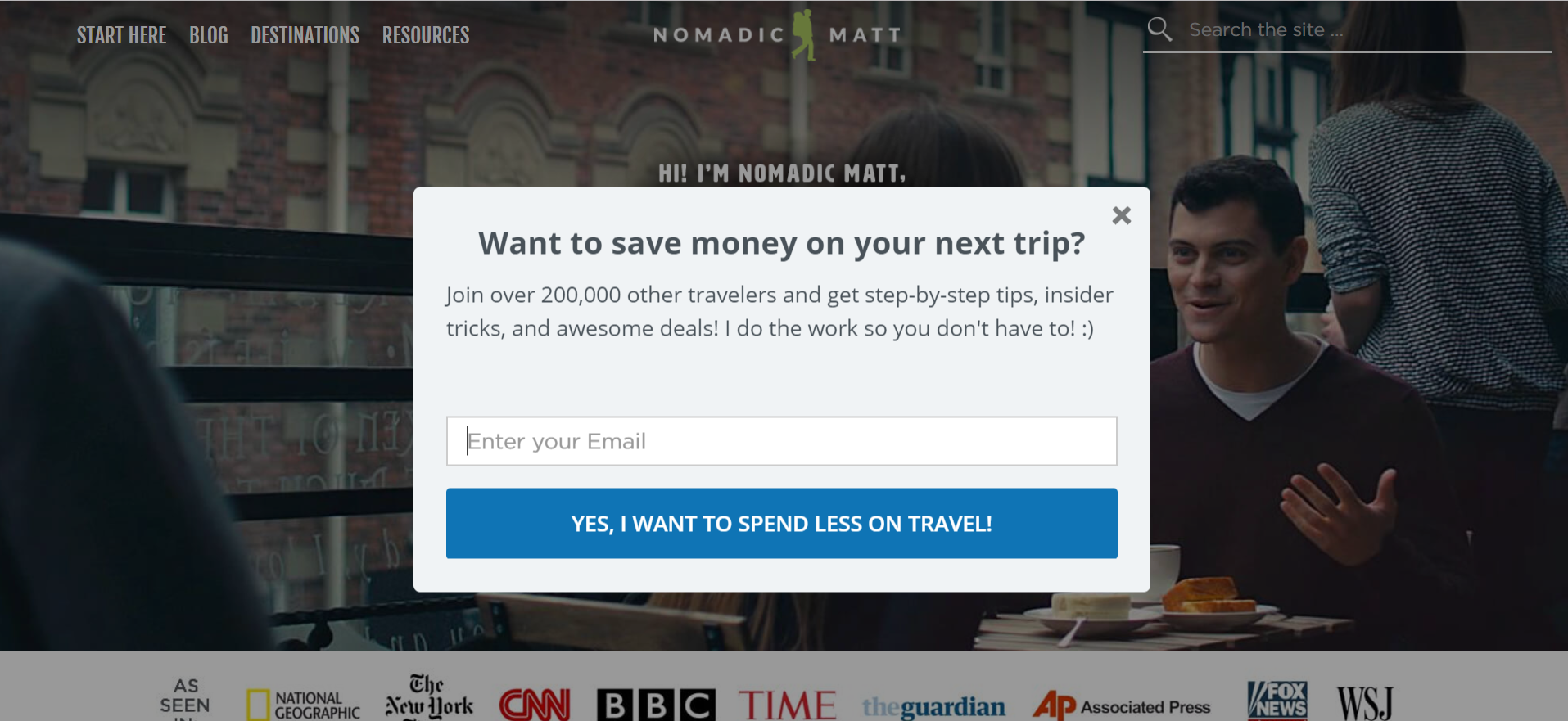
credits – www.nomadicmatt.com
18. SHOW SOME LOVE
In this world where money has become the biggest factor for survival for most people, it is very rare to find someone who cares. That’s exactly why I signed up when I visited www.Iwannabeablogger.com for the first time.
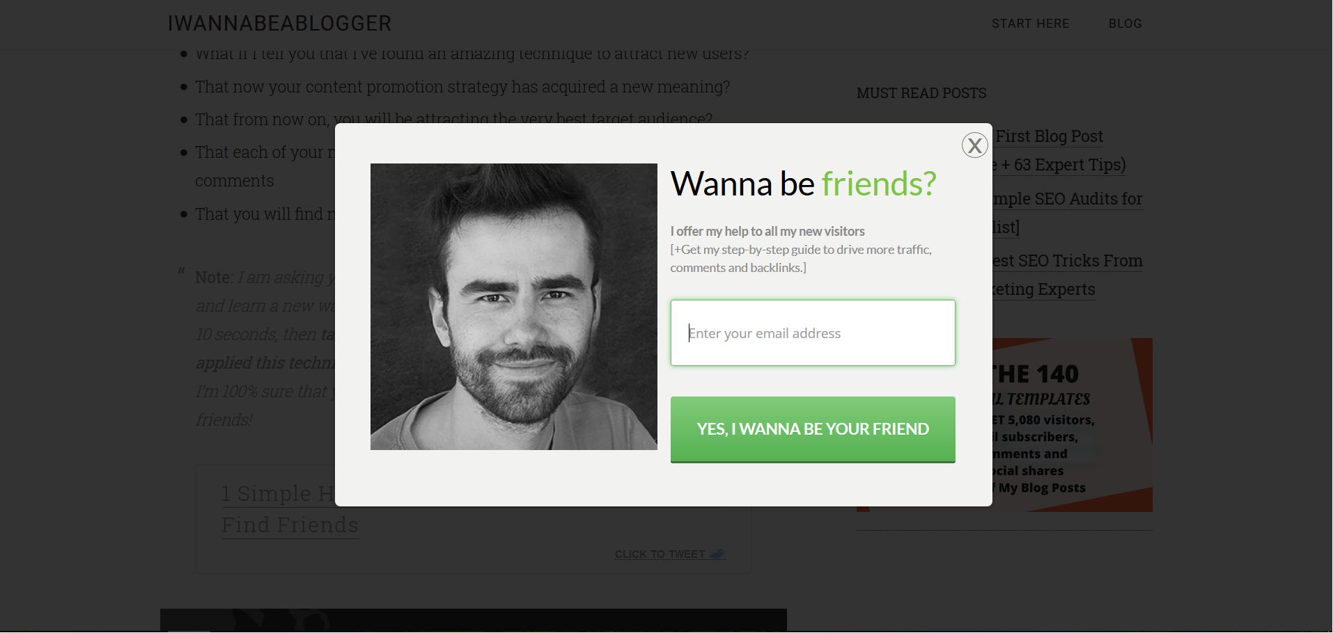
credits – www.Iwannabeablogger.com
19. SURPRISE THEM
And finally… if everything else fails, surprise them. Who doesn’t like to be surprised? Sending a surprise gift is a great idea for a high-converting exit pop up. Pixelme, a URL shortener, has managed to retain a lot of their visitors with exit-intent thanks to their exit pop up.
credits – www.pixelme.me
Summary
If you have a blog that has a decent amount of traffic, you can use a pop up sign up form to convert your eager visitors into loyal subscribers. These loyal subscribers can help you build a passive income online.
However, you’ve to first convert your website visitors into subscribers. You can use a smart pop up sign up form to ask your visitors to sign up. Assume that your visitors see at least ten such pop ups every single day. Then, they wouldn’t want to sign up to your newsletter because, they don’t want to flood their inbox.
To break this defensive shell of your visitors, your pop up form has to strike as unique and offer something they can’t resist. Our list of pop up sign up form ideas will help anyone to improve conversions.
Honorable thanks to Wisepops, Optinmonster, Sparring mind and justuno for helping me create this article.
So, which of these pop up designs appealed to you the most? Or is there a high-converting design that we missed?
Don’t be shy. Just let us know in the comments below. If you find this article informative, kindly share it too…
If you liked reading this blog, please share it with your friends so that they can benefit from it too. 🙂
